Twitter Account Explains How Beauty In Ordinary Things Is Good For Society, And The Viral Thread Is Eye-Opening
Beauty—as well as its absence—is all around us. But it takes a perceptive eye to notice it—or the lack of it—consciously. When it’s entwined with the design of ordinary things, beauty helps create a unique atmosphere that makes us care about our urban environment. However, a lack of it can be harmful and lead to apathy for our surroundings. That’s the lesson that The Cultural Tutor, a popular Twitter account, taught us all in a recent viral thread.
In an educational and, frankly, entertaining thread, The Cultural Tutor analyzed exactly why ordinary beauty has such a positive impact on us. The account also took a look at how blandness is spreading and why a mindset of function-without-form goes beyond just designs that are unappealing to the eye. Scroll down for the full thread and to read how people reacted to it, dear Pandas.
Meanwhile, when you’ve enjoyed this article to the fullest and if you feel like you’d like to learn something else from The Cultural Tutor, then we’ve got you covered. You should definitely take a peek at Bored Panda’s earlier article about their viral thread about the problem with modern architecture right over here.
More info: Twitter | CulturalTutor.com
The Cultural Tutor tackled an important issue about how beauty is disappearing from the designs that surround us
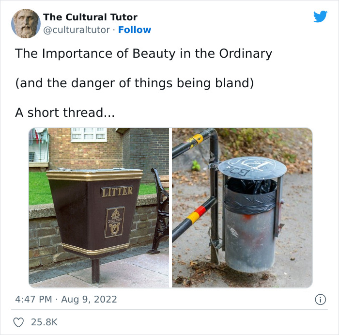
Image credits: culturaltutor
The author analyzed how beauty (or a lack of it) impacts us in our day-to-day lives
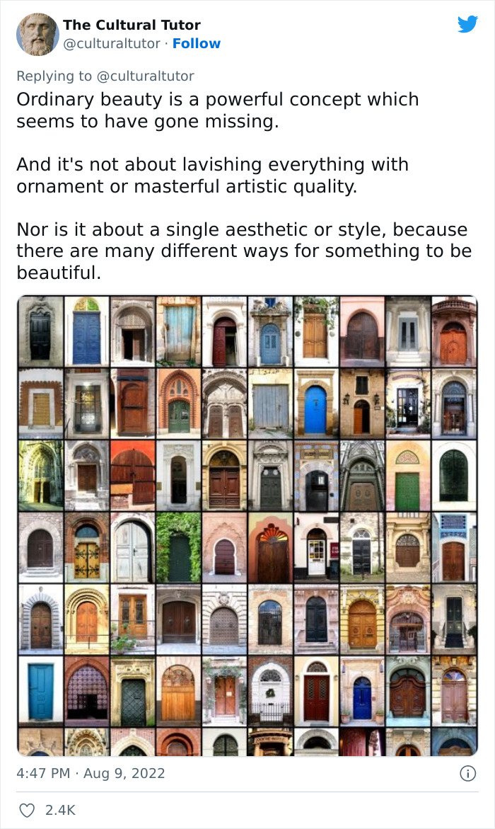
Image credits: culturaltutor
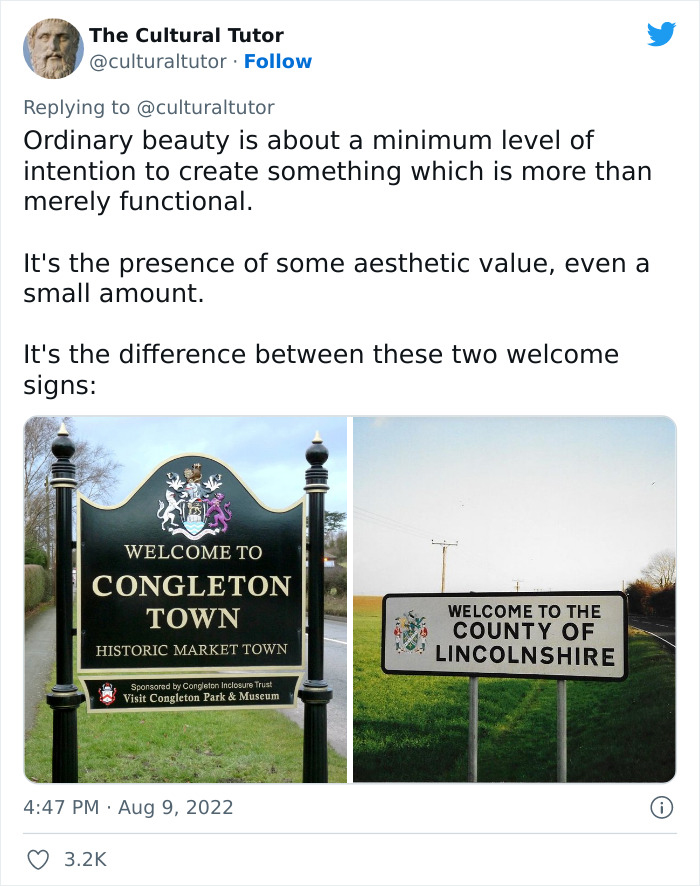
Image credits: culturaltutor
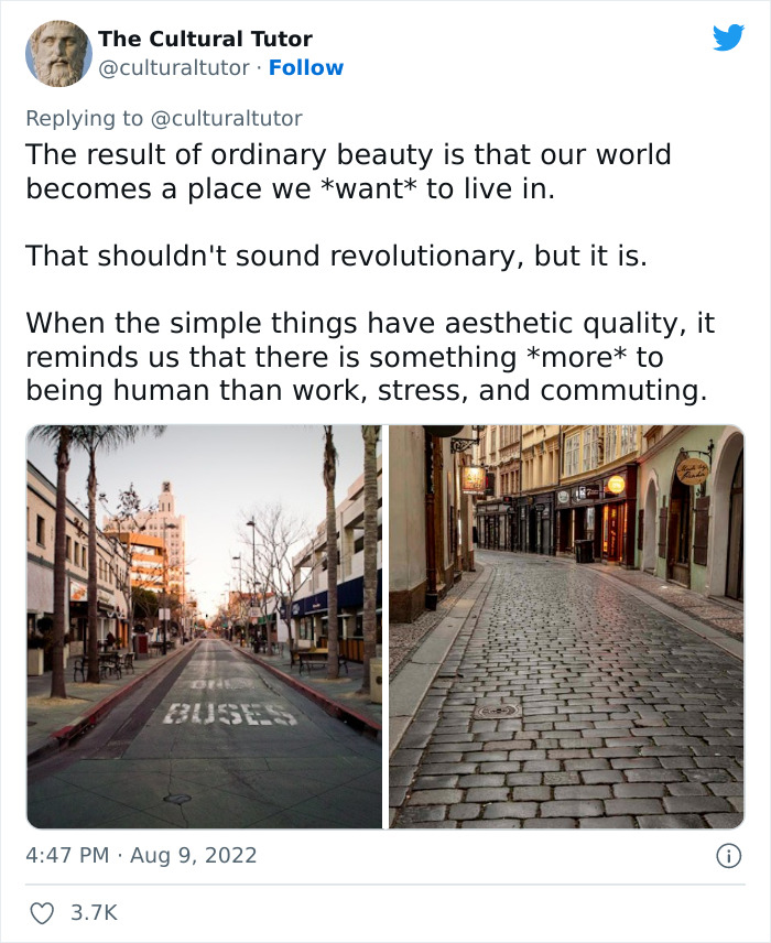
Image credits: culturaltutor
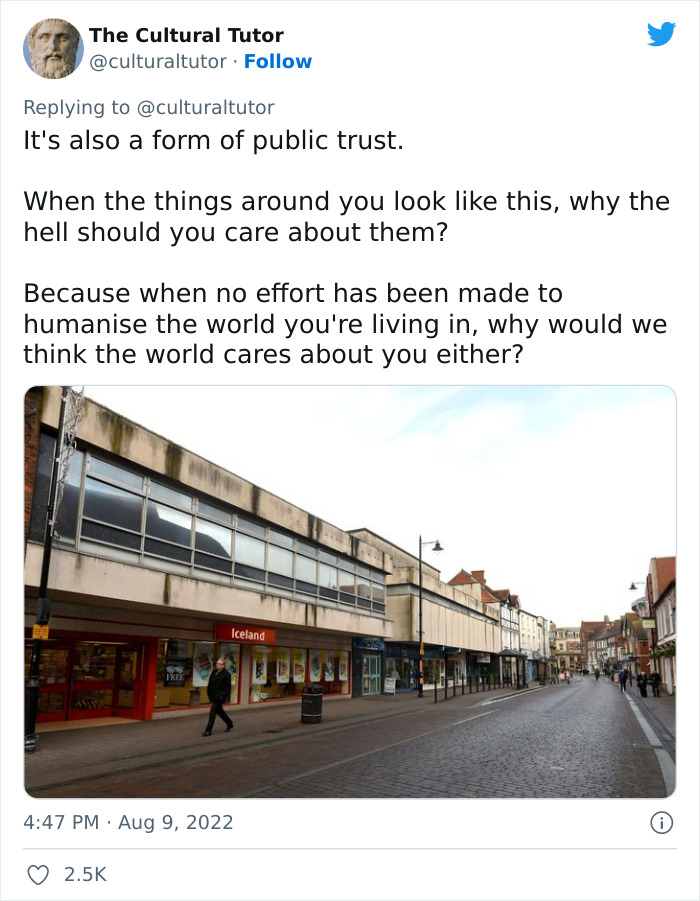
Image credits: culturaltutor
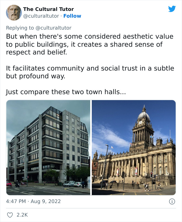
Image credits: culturaltutor

Image credits: culturaltutor
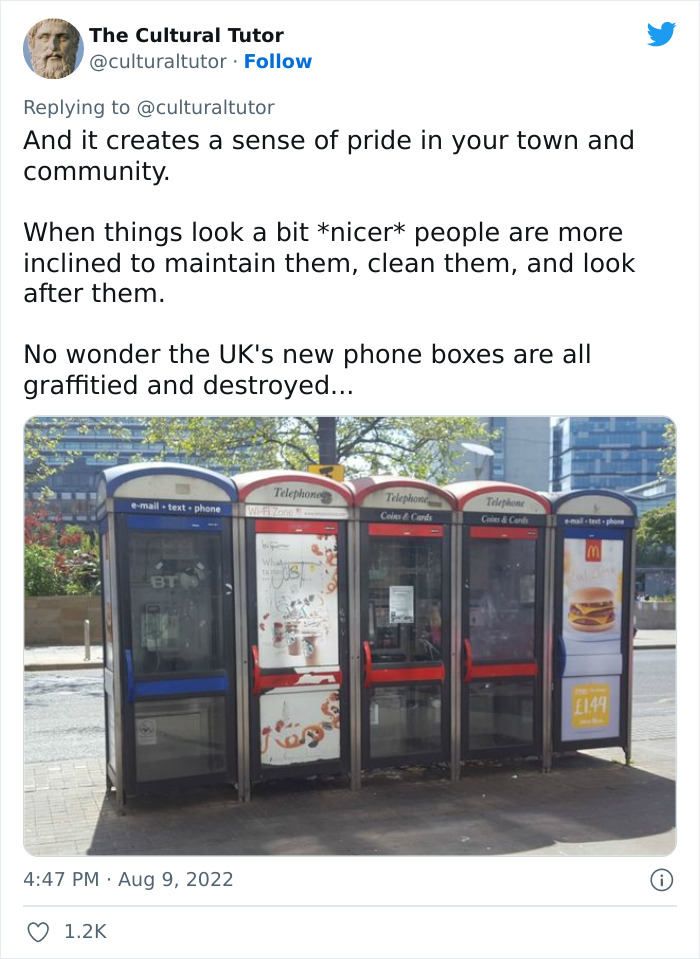
Image credits: culturaltutor

Image credits: culturaltutor
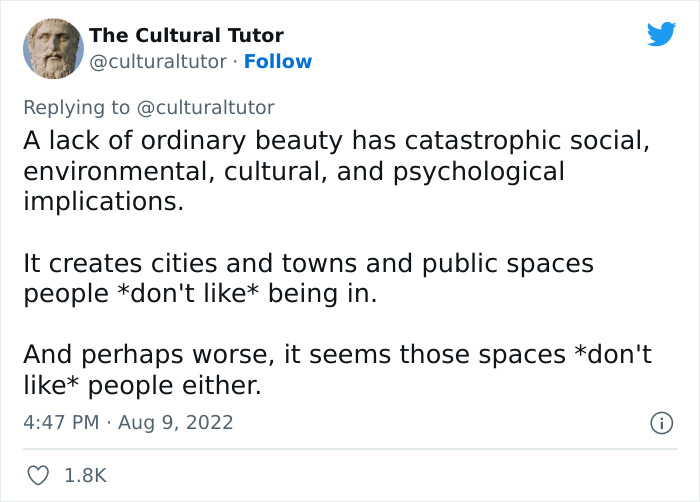
Image credits: culturaltutor
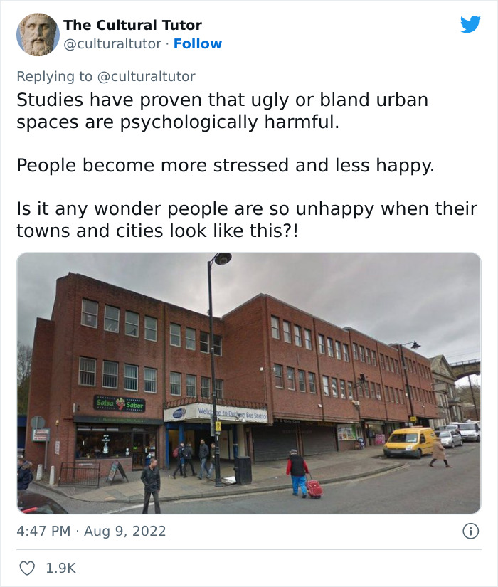
Image credits: culturaltutor
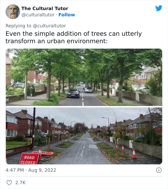
Image credits: culturaltutor
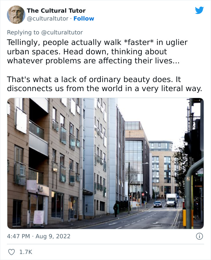
Image credits: culturaltutor

Image credits: culturaltutor
Image credits: culturaltutor
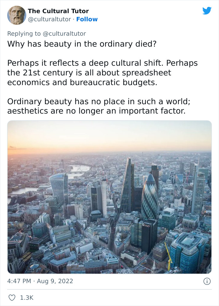
Image credits: culturaltutor
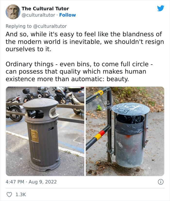
Image credits: culturaltutor
Image credits: culturaltutor
The Cultural Tutor is an account followed by nearly 230k internet users. Much of its popularity is due to the fact that it posts educational, mind-broadening content every Friday. The account touches upon a variety of topics, from design, art, and philosophy to history and, well, culture.
If the creator of the account were a professor at our local university, we’d sign up for his classes in a heartbeat. Though while we’re waiting on that, we’ve got all these awesome Twitter threads and even a possible newsletter waiting for us.
The Cultural Tutor stressed how ordinary beauty is a concept that’s been going away. Artistic flourishes and non-functional ornamentation are being replaced by bland (arguably, soulless) designs. One thought that really stuck with us is how we should create a world that we actually want to live in. That way, we care about our city, our institutions, our neighbors far more.
Or, as TCT puts it, beauty in the ordinary is “also a form of public trust.” Small details, tiny amounts of additional effort all add up into a whole that is far, far greater than the sum of its parts.
In our opinion, there’s definitely a noticeable general trend towards more generic designs, and we’ve actually discussed this recently in another article. From company logos to architecture, corporate art, and far beyond. Bored Panda had a chat about this phenomenon with Matt Johnson, Ph.D., a consumer psychology specialist and professor at Hult International Business School and Harvard University, and the author of ‘Branding that Means Business.’
He explained to us why there’s a trend of company logo homogenization. There are a few reasons for this. “The first is that as we move towards a more digital environment, there’s a need to make brand logos as legible and as easy to identify as possible. The consumer’s attention is strained even more in the online world, so logos can’t afford to be disfluent or challenging to process,” Professor Johnson said.
“Secondly, there also may be a growing realization of the ‘fluency effect’: the relatively robust behavioral science phenomenon that the more fluent a font is written in, the more likable and trustworthy the message. As more brands become familiar with this phenomenon, they may want to test new, more fluently written logos to capitalize on this effect.”
“While this logo trend is seen across a wide array of industries, there may be only one or two within each industry that may make this change, since if everyone did, they would not be differentiating as well. There may be a broader implication of this: if companies begin to recognize that consumers, at least in digital environments, prefer more basic logo designs, brands will rush to be the first in their industry to do so to plant their flag first. While all brands want to be at the razor’s edge of consumer preferences, no brand wants to be seen as the copycat of their competitor,” he mused.
“I imagine the general trend will persist, especially in the digital environment. If it turns out to be the case that more basic, legible logos are more suitable for online preferences, we may also move to a system where each major brand has at least two distinct brand logos: one in the digital world, and one for the physical world. This is already happening to a certain extent since many brands that have gone to a more basic font haven’t completely jettisoned their originals and retained them for specific uses,” Johnson told Bored Panda.
“Since branding is fundamentally about differentiation, there will be an upper limit to how much brand logos can homogenize and go together on a single dimension. It’s great to adapt to new consumer preferences, but if every brand does that in the same way, it fails to differentiate in a significant way. This is why I think there is a ‘race’ within each industry to be the first to do so, which then makes things more difficult for their competitors: should they persist in making their logo more basic, at the risk of looking like a copycat? Or should they cede that positioning and devise a way to differentiate by some other means?”
According to the consumer psychology specialist, brands can differentiate themselves in other ways. “For example, brands may double down on fluent soundmarks, tighter taglines, or speaking product features that are trademarked and exclusive. In this way, we may see a much richer adaptation to the online world, which goes above and beyond the legibility of brand logos.”
Here’s how some people reacted to the viral Twitter thread and what they thought about the relationship between aesthetics and functionality

Image credits: harrydaniyan
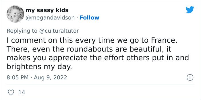
Image credits: megandavidson
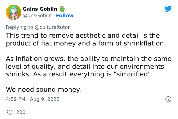
Image credits: gnsGoblin
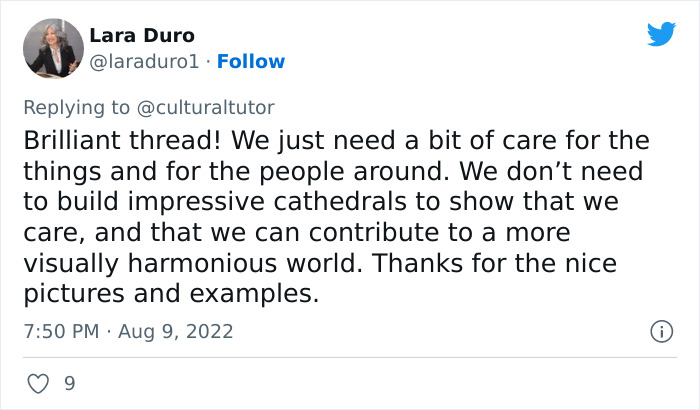
Image credits: laraduro1
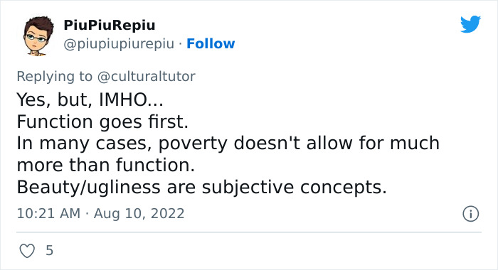
Image credits: piupiupiurepiu
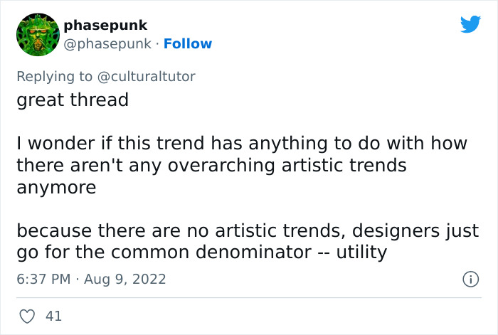
Image credits: phasepunk
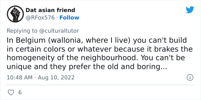
Image credits: RFox576
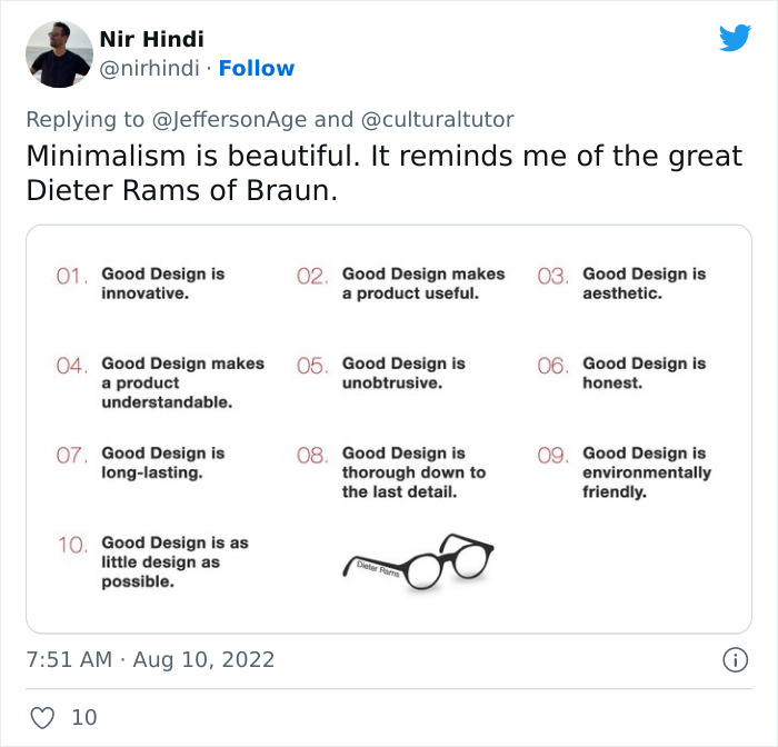
Image credits: nirhindi
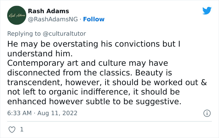
Image credits: RashAdamsNG
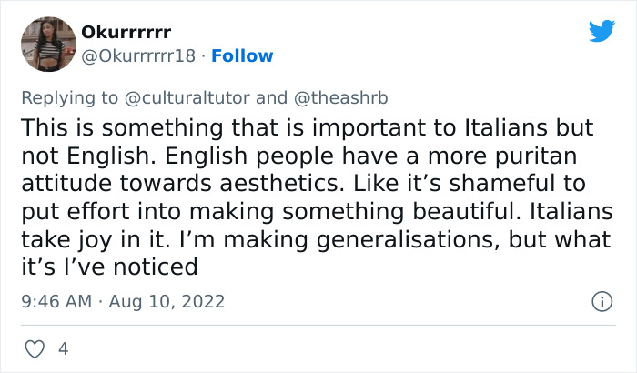
Image credits: Okurrrrrr18
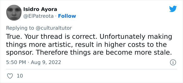
Image credits: ElPatreota
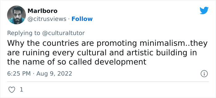
Image credits: citrusviews
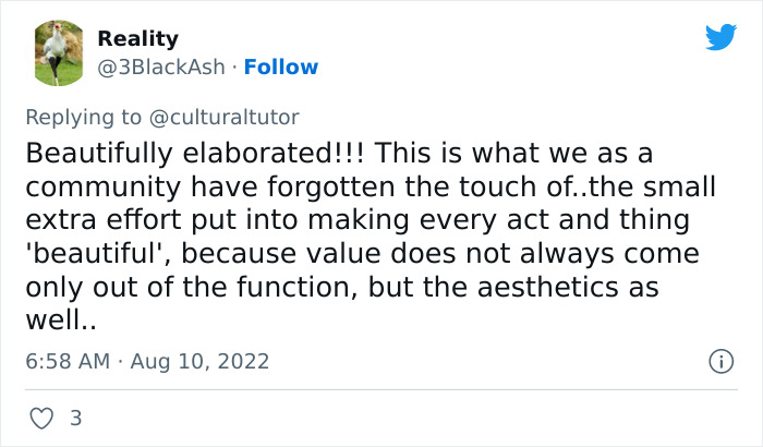
Image credits: 3BlackAsh
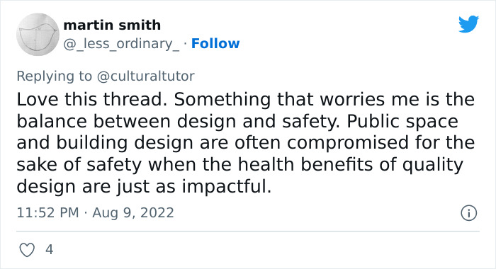
Image credits: _less_ordinary_
Image credits: SarahMcHarg
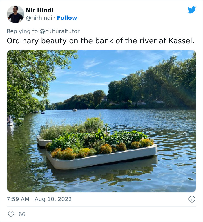
Image credits: nirhindi
The post Twitter Account Explains How Beauty In Ordinary Things Is Good For Society, And The Viral Thread Is Eye-Opening first appeared on Bored Panda.

No comments