This Tumblr Thread Sheds Light On Dyslexia-Friendly Fonts And It’s Very Important
It’s the font that appalls graphic designers, makes typographers cringe, and has been relentlessly mocked on the internet in instances like the famous Doge meme. In 1999, two graphic designers, Dave and Holly Combs, even started a movement to ban it. I am talking the font that has divided (or rather united?) an entire generation—the blessed and the cursed Comic Sans.
And while the only ones with a soft spot for Comic Sans are often primary and secondary school children, this Tumblr thread has put a whole new perspective on the font. In an attempt to win back the love it really deserves, the thread has explained how some of our least popular fonts are perfect for dyslexic people with difficulty in reading.
Incredibly, Comic Sans is not the only dyslexia-friendly font, so read the thread in full to find out why Times New Roman doesn’t have to be your default typeface.
This Tumblr thread has shed light on dyslexia-friendly fonts and it explains why Comic Sans deserves far more love
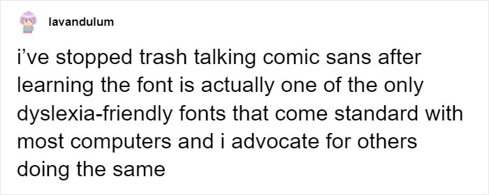
Image credits: lavandulum
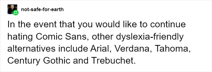
Image credits: not-safe-for-earth

Image credits: not-safe-for-earth
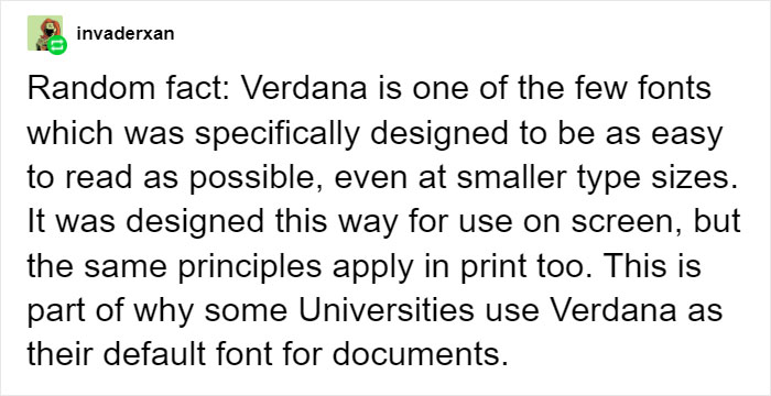
Image credits: invaderxan

Image credits: sweetheart-sona

Image credits: anastasiaoftheironwood

Image credits: writernotwaiting

Image credits: iamhisgloriouspurpose


Image credits: catwinchester

Image credits: catwinchester

Image credits: pitbullmabari

Image credits: demigirldemigoddess
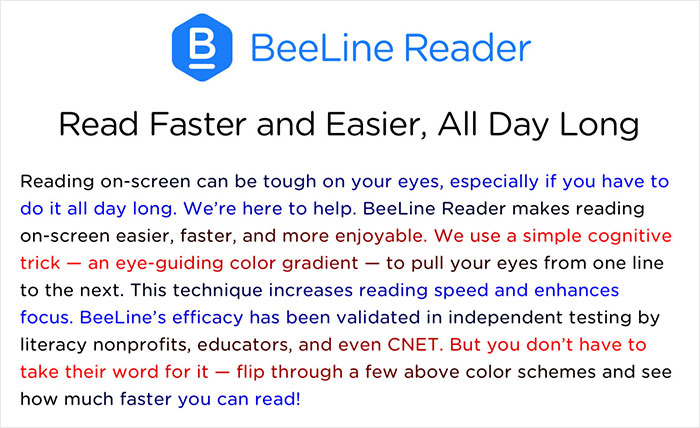

Image credits: lunariens

Image credits: hashtagyourshirt

Image credits: welcometotheravenclawcommonroom

Image credits: ta-lunelle
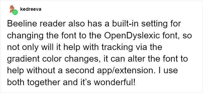
Image credits: kedreeva
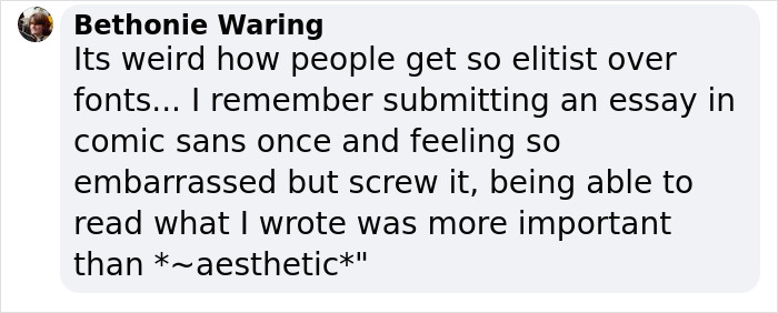
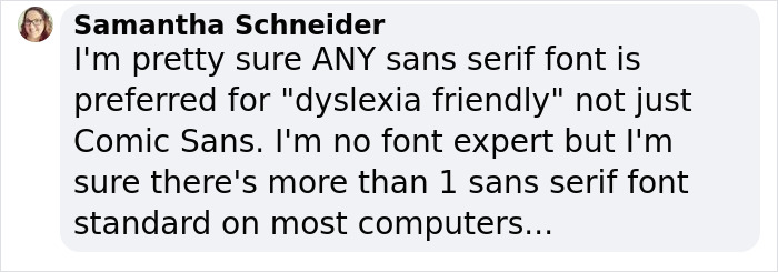
And this is what people had to comment


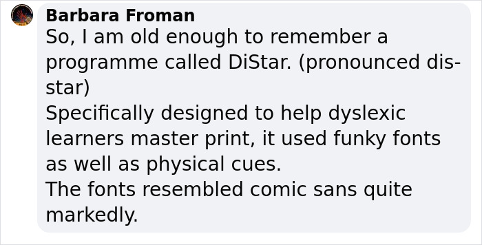

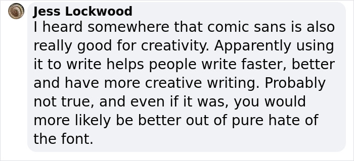



The post This Tumblr Thread Sheds Light On Dyslexia-Friendly Fonts And It’s Very Important first appeared on Bored Panda.

No comments